Theme
Theme Management is the visual identity control center for your tenant's landing page. It allows administrators to select pre-built theme templates, customize page blocks, edit content copy, and fine-tune brand colors — all from a single interface with live preview capabilities. Access uses the Settings permission.
Overview
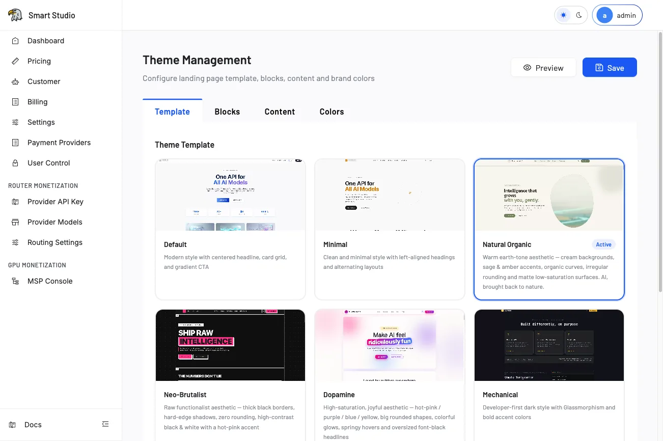
The Theme Management page provides four configuration tabs: Template, Blocks, Content, and Colors. A persistent toolbar at the top offers Preview (to inspect changes before publishing) and Save (to persist and deploy). The subtitle reads: "Configure landing page template, blocks, content and brand colors."
Template tab
The Template tab presents a gallery of pre-designed landing page themes. Each template card shows a visual preview and a brief description of its aesthetic:
| Template | Style Description |
|---|---|
| Default | Modern style with centered headline, card grid, and gradient CTA. |
| Minimal | Clean and minimal style with left-aligned headings and alternating layouts. |
| Natural Organic | Warm earth-tone aesthetic — cream backgrounds, sage & amber accents, organic curves, irregular rounding, and matte low-saturation surfaces. |
| Neo-Brutalist | Raw functionalist aesthetic — thick black borders, hard-edge shadows, zero rounding, high-contrast black & white with a hot-pink accent. |
| Dopamine | Vibrant, high-energy palette with bold gradients and playful typography. |
| Glassmorphism | Frosted-glass panels with blur effects and translucent layers. |
| Fugu | Marine-inspired blues with rounded cards and soft shadows. |
| Kilo | Dark-mode first with neon accent colors and sharp geometric shapes. |
Additional templates are available by scrolling. The currently active template is highlighted with an Active badge and a blue border.
Switch templates
- Browse the template gallery and click a template card to select it.
- Click Preview to see the landing page with the new template applied.
- If satisfied, click Save to publish the change.
Blocks tab
The Blocks tab allows you to configure which content sections appear on the landing page and their ordering:
- Hero Block — Main banner with headline, subtitle, and CTA button.
- Features Block — Grid of feature cards with icons and descriptions.
- Models Block — Showcase of available AI models.
- Pricing Block — Pricing tier cards.
- FAQ Block — Frequently asked questions accordion.
- Footer Block — Bottom navigation and legal links.
Each block can be enabled/disabled via toggle and reordered via drag-and-drop.
Content tab
The Content tab provides text editing for all visible copy on the landing page:
- Hero headline and subtitle text.
- Feature card titles and descriptions.
- CTA button labels and link targets.
- SEO metadata (page title, meta description).
- Custom announcement banners.
Content supports markdown formatting in description fields and accepts internationalized text when the i18n module is enabled.
Colors tab
The Colors tab controls the brand color palette applied to the landing page:
- Primary Color — Main accent color used for buttons, links, and highlights.
- Secondary Color — Supporting color for secondary actions and borders.
- Background — Page background color or gradient definition.
- Text Color — Default body text color.
- Surface Color — Card and container background.
Color changes apply globally to the selected template and persist independently of template selection.
Before you start
- Prepare approved product naming and brand assets (logos, color codes).
- Confirm contrast and readability in both light and dark color modes.
- Keep a copy of the existing configuration before making changes.
Tips
- Always use Preview before saving — it opens the landing page in a sandboxed view without affecting live users.
- Template switching resets block ordering to the template's default; re-check Blocks after switching.
- Color values accept HEX (
#FF5733), RGB (rgb(255, 87, 51)), or CSS variable references. - Changes propagate to the live landing page within 30 seconds of saving; CDN cache may add minor delay.
- The active template badge updates only after a successful save operation.
Next Step
Continue with User Control to manage administrator access, or configure SSO for authentication and identity flow.